A Practical Guide to Color Mixing Charts for Artists and Crafters
Think of a colour mixing chart as your personal recipe book for creating any shade you can dream of. It’s like a visual map that shows exactly how a few basic colours can combine to produce an entire rainbow of new hues. For anyone who works with colour—painters, quilters, dyers, you name it—this simple tool is a game-changer.
Your Essential Roadmap to Mastering Colour
A colour mixing chart is so much more than a pretty reference. It’s a hands-on tool that takes all the guesswork out of your creative projects. With a good chart, you can figure out what a colour mix will look like before you commit, match a specific shade you have in mind, and really start to understand how different colours play together.
For so many of us, getting the colours right is what takes our work from good to great. Whether you're blending paints for a masterpiece or picking out threads for an embroidery pattern, a chart is your trusty guide. It helps you steer clear of those disappointing muddy messes and gives you the power to build beautiful, deliberate colour palettes.
A colour mixing chart turns abstract theory into something you can actually see and use. It’s the bridge between the colours you have and the colours you want, giving you total control and confidence.
Why This Tool Is So Effective
The real magic of these charts is that they are so simple and hands-on. Instead of just looking at a colour on a screen, you create a physical record of how your specific materials behave. This is a big deal because pigments in paints and dyes can look quite different from one brand to another.
If you work with textiles, you know how important those little differences are, especially when you’re trying to coordinate fabrics from a line like the Art Gallery Fabrics Pure Elements collection.
This practical approach is a cornerstone of art education for a reason. Studies from California schools have shown that using colour mixing charts can lead to a 15–20% increase in students' colour-application scores. In fact, they're used as a fundamental teaching tool in about 70% of elementary art classes to help students build a solid foundation in colour theory. You can dive deeper into the role of primary colours in education in this detailed overview on Wikipedia.
Understanding How Colour Works in Paint and on Screens
Have you ever mixed red and green paint hoping for a nice colour, only to end up with a muddy brown? But then you see those same two colours on a screen, and they magically create a bright, sunny yellow. What gives?
It’s not magic, but it does come down to two totally different ways of creating colour. One method belongs to the physical world of paint, ink, and dye, while the other lives in the digital world of screens and light. Getting a handle on this difference is the first step to truly mastering any colour mixing chart you come across.
The Subtractive Colour Model: Mixing with Pigment
When you’re working with physical materials like paints or dyes, you’re in the world of the subtractive colour model. The best way to think about it is like stacking coloured sheets of plastic on top of each other. Each layer you add subtracts certain wavelengths of light, letting less light pass through to your eye.
This is exactly why mixing more and more paint colours together eventually leads to a dark, murky mess. Each pigment you add is absorbing more light, reflecting less back. The traditional primary colours here are Red, Yellow, and Blue (RYB). In theory, mixing all three primaries gives you black, because you've subtracted almost all the light. This is the system that governs pretty much every hands-on craft.
The subtractive model is all about removing light. Every pigment you add takes away a piece of the visible spectrum. The more you add, the less light makes it back to your eyes, resulting in darker colours.
If you're curious about the nitty-gritty of why physical colours behave this way, you can dive deeper into the science behind pigment and dye-based colours for a more detailed look.
The Additive Colour Model: Creating with Light
Now, let's switch gears to your computer monitor or smartphone. These devices work on a completely opposite principle: the additive colour model. Instead of starting with white and taking light away, screens start with black and add light in.
Picture three spotlights in a dark room—one red, one green, and one blue. Where the beams of light overlap, they combine to create lighter, brighter colours. That's the additive model in a nutshell. Its primary colours are Red, Green, and Blue (RGB).
When you mix all three RGB lights together at their brightest, you don't get black—you get pure white light. That white screen you're looking at is actually made of millions of tiny red, green, and blue lights all firing at once. This is why a digital colour chart won't always give you the same results with physical dyes; one is adding light, and the other is taking it away.
To make this crystal clear, here’s a quick side-by-side comparison.
Subtractive vs. Additive Colour at a Glance
| Attribute | Subtractive Colour (Paint/Ink) | Additive Colour (Light/Screens) |
|---|---|---|
| How it Works | Starts with white, subtracts light | Starts with black, adds light |
| Primary Colours | Red, Yellow, Blue (RYB) | Red, Green, Blue (RGB) |
| Mixing All Primaries | Creates Black (or a dark brown) | Creates White |
| Mixing More Colours | Results in darker colours | Results in lighter colours |
| Common Uses | Painting, fabric dyeing, printing (CMYK) | TV screens, computer monitors, phones |
Understanding this core difference is your secret weapon. It helps you anticipate how colours will behave, whether you’re mixing dye in a pot or choosing the perfect thread colour on your computer for an embroidery project.
How to Create Your First Colour Mixing Chart
Jumping into colour mixing is one of the most satisfying things you can learn, and making your first chart is way easier than it looks. Think of it as creating your own personal recipe book for colour. This hands-on process turns abstract theory into a practical guide that shows you exactly how your specific paints or dyes will behave. It’s time to get to know your palette.
The core idea is beautifully simple. You'll create a grid, placing your primary colours—typically Red, Yellow, and Blue for pigments—along the top row and again down the first column. Where a row and column meet, you’ll paint the result of their mixture. This simple exercise builds a visual library of every combination possible with your starting colours.
This diagram clearly shows the fundamental difference between mixing light (additive) and mixing physical things like paint or dye (subtractive).
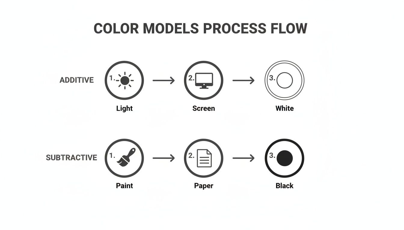
As the diagram shows, when you mix pigments on paper, the colours get darker. Your chart will bring this principle to life right before your eyes.
Setting Up Your Mixing Grid
You don't need to get fancy to start. A piece of sturdy paper, your chosen colours, a brush, and some water are all you need to get going.
- Draw Your Grid: Grab a pencil and ruler and draw a grid. If you're starting with three primary colours, a 3x3 grid is perfect. For a more detailed chart that includes secondary colours, a 6x6 grid is a great next step. Just be sure to leave a small gap between the squares so the colours don't bleed into one another.
- Label Your Axes: Write the names of your primary colours along the top (your X-axis) and down the left side (your Y-axis) in the exact same order. For instance: Red, Yellow, Blue across the top, and Red, Yellow, Blue down the side.
- Paint the Pure Colours: Now for the fun part! Paint a swatch of each pure colour in the squares where it lines up with itself. This creates a neat diagonal line of your original colours running from the top-left to the bottom-right corner of your grid.
Creating a colour mixing chart is like building a personalized dictionary for your paints. Each square you fill in defines a new "word" in your creative vocabulary, giving you the fluency to express any idea with confidence.
The Mixing Process Step-by-Step
With your pure colours laid out, you can start filling in the rest of the grid. It helps to work systematically to keep your chart clear and accurate.
Start by mixing your first top-row colour (let's say Red) with your first side-column colour (Yellow) to create your first secondary colour (Orange). Paint this new mixture into the square where the "Red" column and "Yellow" row intersect.
You'll continue this for every empty square, mixing the corresponding column and row colours. Before you know it, you’ll see a whole family of secondary and tertiary colours appear.
This hands-on exercise is an incredibly powerful learning tool. In fact, it's so effective that an estimated 70% of California art classes use teacher-created colour mixing charts to help students build foundational skills and track their progress. If you're curious, you can learn more about these educational colour systems and their impact.
Taking Colour Charts from Paper to Fabric
When we move from mixing paint on a palette to working with textiles, the world of colour opens up in exciting new ways. But here's the thing: the rules aren't quite the same. While a standard colour wheel is a great guide, you have to account for the unique personalities of fabric, dye, and thread. Getting colour right in textile arts is part science, part visual magic.
With dyeing, you're still in the subtractive colour world, just like a painter. The big difference? The fabric itself is now a key ingredient in your colour recipe. A material's fibre content completely changes how it takes on dye. For instance, a deep navy on cotton might turn into a brilliant, almost glowing sapphire on silk. This happens because different fibres absorb dye and reflect light in their own unique ways.
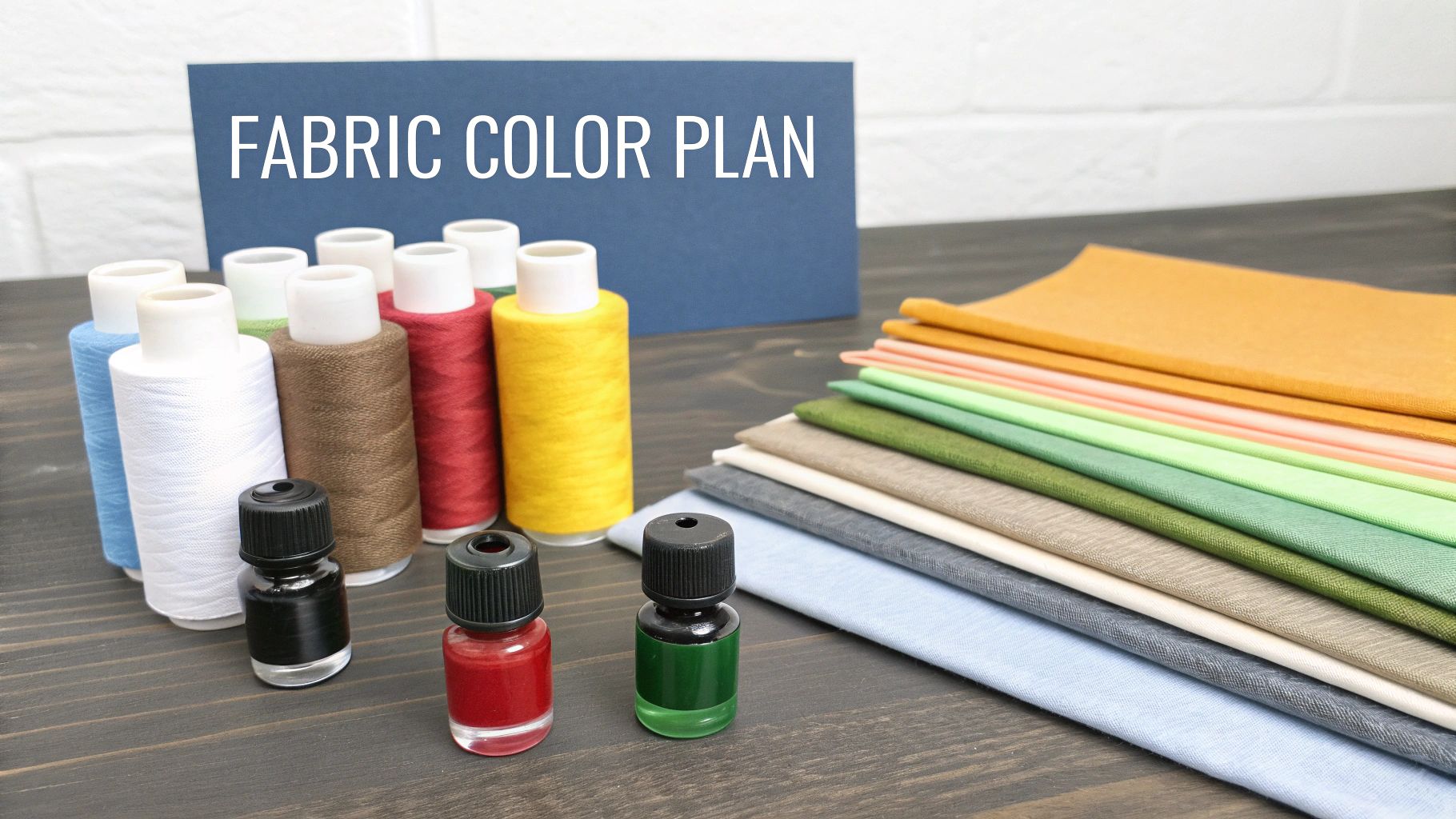
This means any colour mixing chart you use for dyes has to be specific to the fabric you’re working with. The absolute best way to get it right is to create small test swatches on your chosen material to build a personal, and perfectly accurate, chart.
Mastering Colour with Dyes
Dyeing fabric can sometimes feel like a bit of an adventure, where a predictable mix turns into a happy (or not-so-happy) accident. If you keep a few key variables in mind, you'll get much more consistent results and build a colour mixing chart you can truly rely on.
- Fabric Type: Natural fibres like cotton, linen, and silk all drink up dye differently. It's a great habit to create separate charts for each type of fabric you work with often.
- Water Temperature: The heat of your dye bath plays a big role in how the colour bonds to the fabric. As a general rule, hotter water often leads to brighter, more saturated colours.
- Dye Concentration: Your ratio of dye to water is everything. Even a small tweak can take a colour from a delicate pastel to a deep, rich shade.
- Mordants: These are substances like alum or iron that help dye stick to fabric, but they can also tweak the final colour. An iron mordant, for example, is known to "sadden" or darken colours, giving them a more muted, earthy feel.
Think of a dye-specific colour chart as a custom-made map. A map of Toronto is no good if you're trying to navigate Vancouver. In the same way, a colour chart for cotton won't give you accurate results for wool.
Even when you've planned everything perfectly, a little extra dye can sometimes bleed out in the first wash, which is the last thing you want on a finished project. Using a product like a dye catcher is a simple and effective way to protect your work from any unexpected colour runs. You can find some here: https://all-about-sewing-canada.myshopify.com/products/unique-home-dye-catcher-20-sheets.
The Art of Optical Mixing in Quilting and Embroidery
When you get into quilting and embroidery, you start playing with a different kind of colour magic: optical mixing. This is the incredible way our eyes blend small, separate patches of colour into a single new one when we see them from a distance. It's the same principle that makes the pixels on your screen work—get up close, and you see tiny red, green, and blue dots, but take a step back, and they merge into a complete picture.
In embroidery, you can place stitches of yellow thread right next to stitches of blue thread to create the illusion of green. Artists call it pointillism, and it allows for incredibly subtle shading and depth without ever physically mixing pigments. Variegated thread is a fantastic example of optical mixing; its colours constantly shift and blend as you stitch, creating a beautiful, multi-toned effect all on its own.
Quilters do the same thing with fabric. Placing small pieces of different coloured fabrics together in a block makes them blend visually. A quilter might place a yellow-orange fabric next to a red-orange one to create a smooth, fiery gradient that seems to glow. For this kind of work, fabric swatch cards and thread colour cards become your new colour mixing charts, helping you plan your visual recipes and create palettes that truly sing.
Practical Tips for Achieving Clean and Accurate Colours
Knowing the theory behind colour mixing is one thing, but getting your hands dirty is where the real magic happens. We’ve all been there—aiming for a vibrant hue but ending up with a dull, muddy mess. These time-tested tips will help you mix clean, predictable colours, whether you're working with paint, dye, or even thread.
The biggest secret to avoiding mud? It usually comes down to something called colour bias. Think of it this way: most primary pigments aren't perfectly pure. They almost always lean a little warm (towards orange) or a little cool (towards blue). A "warm" red has a tiny bit of yellow in it, while a "cool" red has a subtle blue undertone.
So, if you mix a warm red with a cool blue, you’re accidentally introducing all three primaries (Red, Yellow, and Blue) into the mix. That's a direct recipe for a muted, brownish purple instead of a brilliant one.
Start with a Clean Foundation
This might sound obvious, but a clean workspace is absolutely essential for getting true colours. A contaminated brush or a messy palette can instantly ruin your mix by sneaking in pigments you didn't want.
- Dedicated Water Jars: Keep at least two jars of water handy. Use one for the initial, dirty rinse and the second for a final, clean rinse. This simple step stops you from transferring dark pigment residue into your lovely light colours.
- Pristine Palette: Always wipe your mixing surface clean before starting a new blend. Those tiny dried flakes of old paint have a knack for getting into a fresh mix and spoiling it.
- Good Lighting: Mix your colours in good, neutral light whenever possible. Natural daylight is the gold standard, but a daylight-balanced bulb is a great alternative. Bad lighting can fool your eyes, leading to some unwelcome surprises when you see your project in a different setting.
Here's a pro tip: always add the dark colour to the light colour, not the other way around. Start with your lighter shade and add the darker pigment drop by drop. A tiny speck of a dark colour can completely overpower a light one, but it takes a lot of light paint to fix a mix that’s too dark.
Mix More Than You Need
Trust me on this one: trying to perfectly recreate a custom-mixed colour is a recipe for frustration. It's nearly impossible. A good rule of thumb is to mix about 50% more of any custom shade than you think you’ll need.
Running out of that perfect periwinkle blue halfway through a large project is a total nightmare. This holds true for paint, and it’s just as critical when choosing thread for a big quilting or embroidery design. To avoid this, starting with a consistent, high-quality thread like a Finesse quilting thread solid can save you a world of trouble later on.
Finally, remember that your tools matter just as much as your pigments. For those beautifully mixed colours to look their best, you need to apply them well. You can learn a lot by selecting the right paint brushes and rollers to make sure your vision comes to life perfectly every time.
Get Mixing with Our Downloadable Templates

Alright, enough theory—let's get our hands dirty! The quickest way to truly get a feel for colour is to start mixing it. To help you jump right in, we've designed a few free, printable templates.
Think of these as your launchpad. We've handled the boring grid setup so you can get straight to the fun part. When you create your own physical chart, you build a reference that is perfectly matched to your specific paints, dyes, or inks.
A personalized colour mixing chart is your ultimate creative shortcut. It’s a visual library of recipes you created, ensuring you can replicate that perfect shade for any future project with complete confidence.
Your Free Template Toolkit
Each PDF download is ready to print and comes with straightforward instructions. Before you know it, you'll have a priceless resource you'll come back to time and time again.
- The 6x6 Starter Grid: This is where it all begins. It’s perfect for getting a handle on your primary and secondary colours and seeing how they play together.
- The 12x12 Advanced Chart: Feeling a bit more ambitious? This larger grid lets you map out the subtle world of tertiary shades, opening up a huge palette of 144 potential colours.
- Tints and Shades Explorer: This one is a game-changer. It’s a dedicated template for experimenting with adding white to create tints and black to create shades, instantly expanding any single colour into a whole family of hues.
Common Questions About Using Colour Mixing Charts
Diving into the world of colour mixing can feel a bit like learning a new language. You're bound to have a few questions pop up. Let's tackle some of the most common ones, from figuring out why your mixes look muddy to deciding how many paint tubes you actually need.
Why Do My Mixes Look Muddy?
This is easily the number one frustration for anyone starting out. You aim for a brilliant violet and somehow end up with a murky brown. What gives?
This usually happens when you accidentally mix all three primary colours together. For instance, say you mix a warm red (which has a bit of yellow in it) with a cool blue (which leans a little green, and green is made of blue and yellow). You've just combined red, yellow, and blue, which are the ingredients for a dull, brownish shade.
The secret to clean, vibrant mixes is understanding colour bias. A simple rule of thumb is to mix colours that lean in the same direction—a warm primary with another warm colour, or a cool primary with another cool one. This keeps those unwanted third colours from sneaking in and making mud.
Do I Really Need a Huge Set of Colours to Start?
Not at all! It’s a common myth that you need dozens of tubes of paint to get started. In reality, working with a limited palette is one of the best ways to truly understand how colours interact.
You can mix an incredible spectrum of hues with just a handful of well-chosen primaries. A fantastic starter set for any colour mixing chart would include:
- A warm red and a cool red
- A warm yellow and a cool yellow
- A warm blue and a cool blue
- Titanium white and an ivory black
With just these eight tubes, you have the power to create nearly any colour imaginable.
Why Do My Mixed Colours Look Different When They Dry?
Ever mix the perfect shade on your palette, only to find it looks completely different on your project once it's dry? You're not alone. This is a super common phenomenon, especially with water-based media like watercolours and acrylics.
Watercolours, for example, almost always dry significantly lighter. As the water evaporates, the pigment sinks into the paper, losing some of its initial intensity. Acrylics, on the other hand, often do the opposite. They can experience a "colour shift," causing them to dry a bit darker and more saturated than they looked when wet.
This is precisely why creating your own physical colour mixing chart is so important. It becomes your true-to-life reference, showing you the final, dried result—not just the temporary wet mix.
At All About Sewing, we believe mastering colour is a journey, not a destination. Whether you're choosing the perfect thread or the ideal fabric, we have the high-quality materials you need to bring your vision to life. Explore our collection of sewing and craft supplies to get started.


