Make Your Own Counted Cross Stitch Pattern From Any Photo
Ever looked at one of your photos and thought, "That would make a fantastic cross stitch"? If so, you're in the right spot. Turning a digital image—whether it’s a family portrait, a stunning landscape, or a goofy picture of your pet—into a stitchable pattern is easier than you might think. Forget being limited by store-bought kits; when you create your own design, you're in complete control.
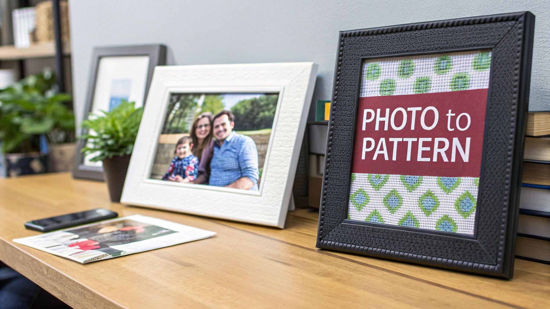
This guide is all about practical skills. We’ll show you exactly how to make your own counted cross stitch pattern and create art that’s deeply personal, one stitch at a time. The core idea is simple: convert a digital image into a grid of coloured symbols. You can get there in two main ways.
- Software Conversion: Let an intuitive program do the heavy lifting for a fast and accurate pattern.
- Manual Drafting: Draw your pattern by hand on graph paper for a truly bespoke, hands-on experience.
Why Design Your Own Patterns?
The biggest draw is total artistic freedom. You get to decide the final size, how simple or complex the design is, and exactly which colours to use. This means you can create pieces that are truly one-of-a-kind and hold special meaning, like stitching a portrait of a beloved pet for a gift or capturing a cherished memory in thread.
The ability to transform personal photographs into art is a game-changer for modern stitchers. It connects a timeless craft with personal storytelling, allowing anyone to create an heirloom from a simple digital file.
This desire for personalization is a huge part of what's driving the crafting world today. The global needlecraft patterns market is booming, reflecting a massive interest in DIY projects and creative side hustles. Projections show the market growing from over USD 34 billion in 2025 to nearly USD 64 billion by 2035. It's a clear sign that custom crafting is more popular than ever with Canadian creators and stitchers worldwide. You can find more details on this trend in the full needlecraft patterns market report.
The Two Paths to a Custom Pattern
So, where do you begin? Your first choice is between technology and tradition. Using software is the fast track; it can generate a complete chart, symbol key, and floss list in just a few minutes. This makes it a fantastic option for complex photos with dozens of different colours.
The manual method, on the other hand, is a more meditative and deliberate process. Armed with graph paper and coloured pencils, you have unparalleled control, letting you simplify shapes and tweak every single detail by hand. This approach is perfect for simpler graphics, logos, or anytime you want to be completely immersed in the creative journey from start to finish. We'll dive into both methods in detail.
Choosing and Prepping the Perfect Image
The journey to make your own counted cross stitch pattern doesn't start with software or graph paper—it kicks off with finding the perfect image. The quality of your source photo will make or break your final stitched piece. A truly stunning pattern is never an accident; it’s born from a great image and a little bit of prep work.
Think of it like cooking. The best chef in the world can't make a gourmet meal from spoiled ingredients. The same logic applies here. If you start with a photo that's blurry, badly lit, or just way too busy, you're going to end up with a muddy, confusing pattern that's a nightmare to stitch.
What Makes a Good Source Image?
When it comes to pattern conversion, not all photos are created equal. You're hunting for images with a clear subject and good contrast. A photo of a single rose against a plain wall, for example, will translate beautifully. A wide shot of a bustling market square? Not so much.
Here’s what to look for in a winner:
- A Strong, Clear Focal Point: Your main subject should be sharp and easy to see. A portrait where the person's face is in crisp focus is a fantastic choice.
- Good Lighting and Contrast: Steer clear of photos that are too dark or completely washed out. An image with a nice range of light and shadow gives the pattern software enough information to create depth and dimension.
- A Simple Background: Busy backgrounds are the enemy. All that visual noise just competes with your subject and turns into "confetti"—those annoying, single-colour stitches scattered all over the place.
An ideal image could be your cat snoozing in a sunbeam, a clean shot of a favourite landmark, or a close-up of a vibrant bouquet. Photos packed with tiny, faraway details, on the other hand, almost always cause problems. Those little details just get lost in the grid and create a mess.
Essential Editing Tricks for a Better Pattern
Once you've picked a promising image, a few quick edits can make a world of difference. You don't need to be a Photoshop wizard; the basic editing tools on your phone or computer are more than enough. These little tweaks are all about setting your project up for success.
The idea isn't to drastically alter the photo, but to optimize it for the pixelated world of cross stitch. By cleaning up the image first, you're giving the pattern-making software—or yourself, if you're drafting by hand—a much better canvas to work with.
Pro Tip: Always, always work on a copy of your original photo. That way, if you get a little carried away with the editing, you can just go back to the original file. It’s a simple habit that will save you a ton of headaches.
Cropping for Impact
Your first and most powerful move is to crop the image. Cropping gets rid of all the distracting stuff around the edges and puts the focus squarely on what matters. Take a look at your photo and ask yourself: what’s the real star of the show here?
If it’s a family photo, crop in tight on the people and cut out that messy corner of the living room. If it's a landscape, maybe the most interesting part is that one dramatic cloud formation, not the whole sky. By zeroing in on your focal point, you create a much stronger composition and a pattern that feels focused and intentional.
Adjusting Contrast and Brightness
Next up, let's play with the lighting. Bumping up the contrast just a little bit can work wonders. This simple tweak makes the dark parts of the image darker and the light parts lighter, which helps define edges and makes the whole thing pop. A pattern made from a high-contrast image will have clearer blocks of colour, making it far easier to read and stitch.
Just be careful not to go overboard. Too much contrast can blow out the bright spots or crush the shadows into black blobs, and you'll lose all that lovely detail. Make small, slow adjustments until your subject stands out nicely. A little boost in brightness can also liven up a photo that feels a bit dim.
Converting Your Image Into a Stitchable Grid
Alright, you've chosen and polished your image. Now for the magic trick: turning those pixels into a grid you can actually stitch. This is the moment your photo starts its real journey toward becoming a piece of textile art. You essentially have two roads you can take to make your own counted cross stitch pattern.
One path is all about technology, using specialized software to do the heavy lifting. The other is a more traditional, hands-on approach with graph paper and your own artistic eye. Neither is right or wrong; it’s all about what feels best for your project and your personal style.
This whole conversion stage is the final step after you've already prepped your image properly.
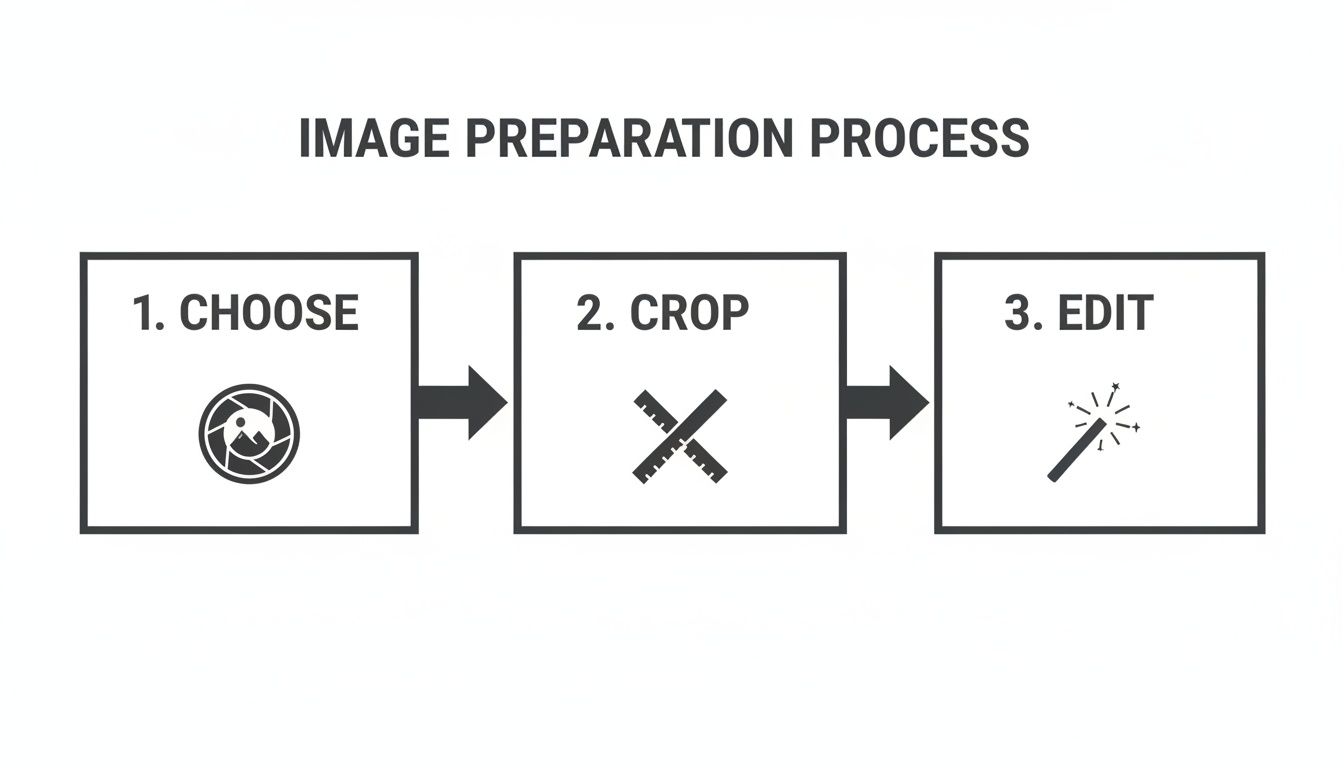
As you can see, getting the image right first—choosing a good one, cropping it well, and making a few key edits—sets you up for success before you even think about turning it into a pattern.
Using Software for Pattern Creation
For most stitchers these days, pattern-making software is an absolute game-changer. These programs, which range from free online tools to more powerful paid software, handle the most tedious parts of the job for you. You just upload your edited image, and the software gets to work, analyzing the colours and translating each pixel into a single cross stitch on a grid.
Most programs will also automatically match each square to a corresponding DMC or Anchor floss colour, spitting out a complete pattern with a symbol key in just a few minutes. This method is a lifesaver for complex, photorealistic projects that might have dozens of different colours, saving you what would otherwise be countless hours of manual charting.
My Advice: When you're using software, the two most critical settings to play with are the final stitch dimensions and the maximum number of colours. I always suggest starting with a lower colour count, maybe around 30-40, to see if the program can capture the image's essence. You can always add more, but starting simple avoids an overly complicated, "confetti"-filled pattern.
This tech-forward approach has played a huge role in the craft's recent revival. The global cross-stitch market was valued at USD 0.15 billion in 2024 and is on a steady rise. A lot of that growth, especially during the pandemic, was fuelled by a new wave of crafters in Canada and around the world who embraced digital tools that made the hobby more approachable. If you're curious, you can read the full research on cross-stitch industry trends to see just how much it's booming.
The Manual Method: Drafting by Hand
If you're someone who loves a more tactile, deliberate process—or if your design is fairly simple, like a logo or a cartoon character—drafting your pattern by hand is an incredibly rewarding experience. This method gives you total, unapologetic control over every single stitch. All you really need is graph paper, some coloured pencils or markers, and your image.
The basic idea is to overlay a grid on your image (you can print one on a transparency sheet or just use a grid feature in a drawing app) and then transfer the design, square by square, onto your graph paper. This lets you make artistic choices on the fly, simplifying awkward shapes, cleaning up messy colour transitions, and adding your own flair in a way a computer algorithm just can't.
Software vs Manual Pattern Making
So, which path should you choose? It really depends on your project, your patience, and your goals. Here’s a quick breakdown to help you decide.
| Feature | Software Method | Manual Method |
|---|---|---|
| Speed | Blazing fast. You can have a pattern ready in minutes. | Slow and deliberate. Can easily take many hours or days. |
| Complexity | Perfect for highly detailed, photorealistic images. | Best for simpler designs with clean lines and shapes. |
| Control | You have control through settings and can edit after. | You have complete artistic control over every stitch. |
| Cost | Can be free with online tools, or a one-time software fee. | Very low cost—just basic art and stationery supplies. |
Ultimately, software is fantastic for speed and detail, while the manual method offers unparalleled creative freedom for the right kind of design.
Calculating Your Final Project Size
No matter which method you use, there's one final piece of math you can't skip: figuring out the actual physical size of your finished piece. This all comes down to your fabric choice. Cross stitch fabric, like Aida, is categorized by its "count"—that is, the number of squares (and therefore stitches) per inch.
The formula is super simple:
Total Stitches ÷ Fabric Count = Final Size in Inches
Let’s run a quick example. Say your new pattern is 140 stitches wide and 210 stitches high.
- On 14-count Aida, your project would be 10 inches wide (140 ÷ 14) and 15 inches high (210 ÷ 14).
- On 18-count Aida, that same pattern shrinks to about 7.8 inches wide (140 ÷ 18) and 11.7 inches high (210 ÷ 18).
Do this calculation before you cut your fabric or make that first stitch. Trust me. It guarantees your finished piece will be the size you imagined and, more practically, that it will fit the frame or pillow you bought for it. There’s nothing worse than pouring weeks into a beautiful project only to discover it’s the wrong size.
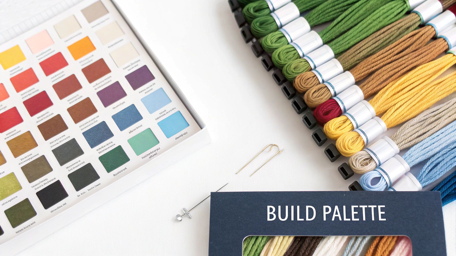
Building Your Palette and Floss Key
Okay, this is where the magic really happens. Choosing your colours is what breathes life into your pattern, turning an abstract image on a screen into a tangible floss palette you can actually work with. Whether you're letting software do the initial heavy lifting or you're drafting everything by hand, this stage defines the entire feel of your finished piece.
If you've gone the software route, you’ve probably noticed it's already done a lot of work for you. Most programs are pretty smart; they'll scan the colours in your image and suggest matches from major thread brands like DMC. It's a huge time-saver, but—and this is a big but—you should never just accept the first result it spits out.
Refining Your Software-Generated Palette
Think of the first palette a program gives you as a rough draft, not the final version. An algorithm doesn't have your artist's eye; it’s just doing a mathematical lookup, matching pixels to the closest floss colour it knows. This can cause a couple of common headaches that are easy to fix with a bit of manual tweaking.
For instance, software loves to pick five shades of blue that are so close you can barely tell them apart. This just adds unnecessary complexity (and cost!) to your project. Your first job is to comb through the list and start merging. Find those nearly identical colours, pick the one you like best, and reassign the others to it.
Another classic issue is a missing key colour. Maybe your photo has a gorgeous, specific shade of sunset orange, but the software swapped it for a dull, muddy brown. This is your cue to step in and override the machine. Manually add the floss colour that you know will better capture the mood you're going for.
Don't be afraid to trust your own judgment over the software's. Your goal is to capture the essence of the image, not create a mathematically perfect but soulless colour-by-number. A thoughtfully curated palette of 35 colours will always look better than a computer-generated mess of 70.
Creating a Manual Colour Palette
If you’re drafting your pattern the old-school way, you get the fun (and sometimes intimidating) task of building your palette from scratch. This gives you complete creative freedom, but it's easy to get overwhelmed. The trick is to start with a limited, cohesive selection that gets the point across without needing a hundred different skeins of floss.
Here’s a practical way to approach it:
- Identify Key Colours: First, just look at your image. Pick out the 5-7 most dominant colours that you see. These are your workhorses—the main blues of the sky, the core greens in a forest, the primary skin tones in a portrait.
- Select Highlight and Shadow Tones: Now, for each of those key colours, choose one lighter shade for highlights and one darker shade for shadows. This simple three-tone system (midtone, highlight, shadow) is a fantastic way to create depth and dimension without blowing up your palette.
- Add Accent Colours: Finally, pick 1-3 vibrant accent colours. These are for the little details that need to pop, like the bright yellow centre of a flower or the tiny glint of light in an eye.
Following this method helps you build a balanced and totally manageable palette, usually landing you in the sweet spot of 20-30 colours total.
Designing a Clear and Usable Symbol Key
Your pattern is essentially a map, and the symbol key is its legend. This is the tool that connects each colour to a unique symbol on your grid. A great key makes stitching a joy; a bad one turns it into a frustrating chore filled with mistakes.
When you make your own counted cross stitch pattern, a clear key is non-negotiable. If your software generated one for you, give it a hard look. Are the symbols distinct and easy to tell apart at a glance? A black circle is fine, but putting a grey circle right next to it is just asking for eye strain.
If you’re making your key by hand, stick to simple, high-contrast symbols. Basic geometric shapes, letters, numbers, and common keyboard characters are your best friends.
- For similar shades: Try assigning symbols that are visually related. For example, you could use an empty square for light blue, a square with a diagonal line for medium blue, and a filled-in square for dark blue.
- Avoid ambiguity: Steer clear of symbols that look too much alike, especially when you're tired. Think O vs. 0, or + vs. x.
It also helps to be aware of what's popular in the crafting community. Right now, for instance, many Canadian stitchers are gravitating toward nature themes and lighter colour palettes. This trend seems to be driven by a younger, digital-native audience that's discovering the hobby. Keeping these shifts in mind can help you create patterns that feel fresh and modern. You can discover more insights about the latest cross stitch trends for 2025.
Ultimately, by building a smart palette and a crystal-clear key, you're not just making a pattern; you're setting yourself up for a truly enjoyable stitching experience.
Making Your Pattern a Joy to Stitch
You've put in the hard work—the image is converted, the colours are just right, and your symbols are all set. Now it’s time for the final, crucial step: getting the pattern ready for stitching. An incredible design can be a real headache if the chart is a pain to follow.
This last stage is all about making the pattern usable. Whether you're a fan of paper charts or prefer working from a tablet, a bit of prep now will save you from squinting and recounting later. Think of this as the final quality check before you get to the fun part.
Printing Big, Multi-Page Charts
If you’re tackling a larger project, your pattern is going to be spread across several pages. Just printing them out won't cut it; you’ll get lost trying to find where one page ends and the next begins. The secret to a manageable multi-page chart is adding overlap guides.
Almost all pattern-making software has a feature for this. When you go to print, look for an option to add an "overlap" or "page margin." Setting this to a few grid squares means the last 3 or 4 rows of stitches from page one will be repeated at the very top of page two.
This feature is a lifesaver. When you finish a page, you can immediately find your starting point on the next one without painstakingly counting squares from the edge. It makes the transition seamless and seriously cuts down on the risk of mistakes.
I always print my charts with a three-square overlap. I then take a highlighter and mark those overlapping rows on the new page. It’s a simple visual reminder that tells me, "Stitch up to this line, then it's time to move to the next sheet." It makes the whole process foolproof.
Going Digital with a PDF Reader
Of course, the alternative to a pile of paper is a digital pattern on a tablet or computer. This has become my go-to method, and for good reason. A well-made PDF version of your pattern is an amazing tool to have.
Using a tablet means no ink, no paper, and your entire project library can fit in your bag. The best part, though, is the zoom function. For those tricky sections packed with confetti stitches or symbols that look a bit too much alike, zooming right in makes everything crystal clear. It saves a lot of eye strain and helps prevent errors.
Most PDF reader apps also come with markup tools. This is fantastic for digitally "highlighting" or crossing off stitches as you complete them. You can track your progress without ever marking up your original pattern. Made a mistake? Just erase the markup and carry on.
The Final Pre-Stitch Checklist
Before you thread that first needle, give your pattern one last look-over. This quick check is your chance to spot any little issues that could become big frustrations later. It’s so much easier to fix a symbol on the screen than it is to rip out a whole section of stitches.
Run through this quick list:
- Symbol Sanity Check: Glance over your symbol key. Are any two symbols too similar? A solid circle "●" and a slightly bolder one "⚫" might look distinct on your monitor but could be impossible to tell apart on paper.
- Strand Count Check: Did you intend to use a single strand for any colours to create a lighter, more delicate effect? Double-check that your key clearly marks this.
- Confetti Zones Review: Find the areas with a ton of single, isolated stitches. Could some of those be changed to a neighbouring colour to make it easier to stitch? Sometimes sacrificing one or two confetti stitches can make a section much more enjoyable without affecting the final look.
- Key Information: Is all the essential info there? Your chart should absolutely include the final dimensions (in stitches), the fabric count it was designed for, and a complete floss list with brand names and colour codes.
This final once-over is the last thing standing between all your design work and the pure pleasure of stitching. Taking these extra few minutes to make your pattern as stitcher-friendly as possible is the key to a relaxing, fun creative session.
Your Top Pattern-Making Questions, Answered
Jumping into custom pattern design is a ton of fun, but it’s natural to have a few questions pop up along the way. Whether you're wondering about the right fabric or what to do with those pesky single stitches, let's tackle some of the common things that trip people up when they first make their own counted cross stitch pattern. Getting these sorted out now will make the whole process much smoother.
Think of this as a little chat about the nitty-gritty details—fabric counts, colour palettes, legal stuff, and taming your pattern before you even thread a needle.
What Fabric Count Is Best for a Photo Pattern?
When you’re working from a photo, you’ll want to capture as much detail as possible. For that, I almost always recommend a higher fabric count, like 16 or 18-count Aida. The stitches are smaller, which gives the final piece a smoother, less "pixelated" look, kind of like a high-resolution print. This is what lets you see the subtle details in faces or the delicate textures in a landscape.
That said, 14-count Aida is the trusty workhorse of the cross-stitch world for a reason. It's a fantastic all-rounder, especially if you want a quicker project or prefer not to strain your eyes. The stitches are a bit bigger and more forgiving, making it a comfortable choice for many stitchers.
The biggest thing to remember is how much fabric count changes the final size. A design that’s 140 stitches wide will be a full 10 inches on 14-count fabric. On 18-count, that same design shrinks to just under 8 inches. Always do the math before you cut your fabric to avoid any nasty surprises!
How Many Floss Colours Should I Use?
Ah, the classic question! There’s no single perfect number, but I’ve found the sweet spot for a detailed photo pattern is usually between 30 and 50 colours. This range gives you enough different shades to create depth and realistic blending without making your thread box explode.
If you use too few colours, your image might look blocky or "posterized," losing all those lovely, subtle gradients. On the flip side, some software programs can suggest over 100 different colours, which not only gets expensive but can make the actual stitching feel like you're juggling chaos.
My best advice is to play around with it. Start by telling your pattern software to use a maximum of 40 colours. Generate the pattern and really look at it. If you feel like you're losing important details in a portrait's eyes, try nudging the number up. If you see five shades of brown that are practically identical, you know you can safely bring it down.
Can I Sell Patterns I Make From My Own Photos?
You absolutely can! If you took the photograph yourself or drew the original artwork, you own the copyright. That means you have every right to create and sell what’s called a "derivative work"—in this case, your cross stitch pattern. It's a fantastic way to share your creativity and maybe even start a small business.
The golden rule here is simple: you must never use images you don’t have the rights to. This includes:
- Pictures you found on Google Images.
- Photos of celebrities.
- Screenshots from movies, TV shows, or video games.
- Artwork made by another artist.
Using copyrighted material without permission isn't just bad form; it's illegal and can get you into real trouble. To protect yourself and respect other artists, always stick to your own photos, your own art, or images that are confirmed to be in the public domain.
How Do I Fix All the Confetti Stitches in My Pattern?
"Confetti" is what stitchers call those annoying, single stitches of one colour floating in a sea of another. They can be a total nightmare to work, forcing you to start and stop your thread for just one tiny stitch. A pattern loaded with confetti will slow your progress to a crawl.
Luckily, you don't have to just suffer through it. The most hands-on fix is to edit the pattern manually. Just go in and change that lonely blue stitch to match one of its neighbours. In the grand scheme of the finished piece, that one tiny change will be invisible, but it will make your stitching experience so much better.
Before you start editing stitch by stitch, though, try an easier fix first. Go back to your pattern software's settings. Simply reducing the total number of colours in the palette often encourages the program to create larger, more solid blocks of colour, which naturally gets rid of a lot of confetti. Some of the more advanced programs even have a specific "reduce confetti" or "smooth colours" button that does the hard work for you. A few clicks here can save you hours of stitching frustration later.
Ready to start your next project with the best tools and materials? At All About Sewing, we have everything you need, from high-quality embroidery floss and fabrics to the latest sewing and embroidery machines. Explore our selection and get expert advice to bring your creative vision to life. Find your perfect supplies at https://all-about-sewing-canada.myshopify.com.


